Lululemon, a high-end athletic apparel brand, had a website that could use a little love. Our designers tied in Valentine's Day themes alongside evergreen design pages.
Consumers pay a premium for Lululemon products. While people love this luxury brand for it's high-end apparel, our team wanted to design a web design consumers would fall head over heels for. The current website leaves something to be desired. The website is a missed opportunity to provide a high-performing shopping experience online.
If Lululemon is already succeeding in the market, imagine what they could achieve if they enhanced their online storefront! With the rise of demand athleisure (athletic leisure wear) from the increase of remote work across the world, more brands are popping up. While Lululemon may be a leading brand, the competition is only getting fiercer. To keep their footing in the market, they could truly benefit from some design tweaks online.
In the spirit of Valentine's Day, we gave Lululemon's website a little makeover. See for yourself the potential this eCommerce website has. Always Fresh won't let a brand get stale on our watch!
Let's be honest, their website design is a bit of a yawn. We love a clean look, but they don't exactly draw you in with their digital presence. It feels a little lazy for such a top performer. This is most likely result of relying on their brand awareness and popularity among consumers.
We subscribe to the belief that, in order to stay relevant, you need to stay innovative and keep up with your marketing strategy. Think about Blockbuster. Ring a bell? They were the big dogs, and they felt pretty good about themselves. The underdog was Netflix. A new streaming site that didn't stand a chance. Yet...their innovative movie rental methods and evolution to video streaming services are now the seemingly unstoppable brand! And where is Blockbuster?
So yeah...don't sleep on your marketing efforts. Things change quickly, especially with all the technology we can get our hands on these days.

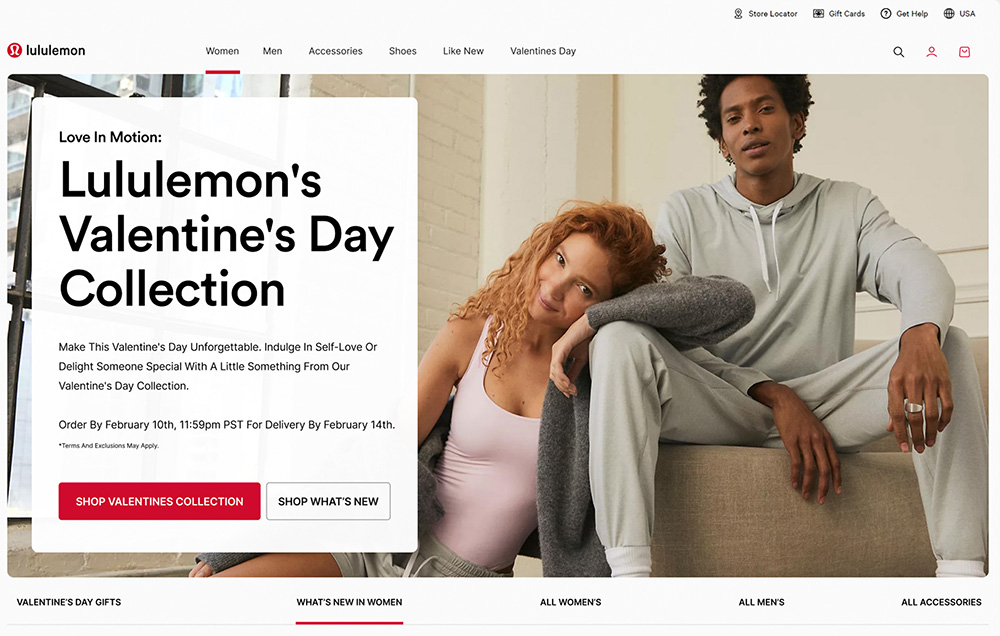
Speaking of marketing strategy, who doesn't like a good holiday campaign? Any time there's a celebration (especially when gifts are involved), eCommerce businesses should offer their admirers an opportunity to give their product as the perfect gift!
We tied in messaging targeted for couples on Valentine's Day in tandem with messaging for all the single ladies (couldn't write a Valentine's day blog and not reference the queen herself, Beyonce). Whether it's a gift for her, for him, or indulging in self-love, we placed Lululemon as top of mind.

When it comes to design, we wanted to use colors associated with Valentine's Day. That's why our designer chose a chocolate brown, sweet pinks, and juicy reds. That's a deadly combo, connecting the seasonal holiday to Lululemon's signature colors. We focused on indulging in the sweetness of the occasion while staying true to the brand's vibe.
We mentioned that their design was on the...ermmm...boring side to put it bluntly. Don't get us wrong, we think simple can be really classy. You just have to execute it well. There's a major difference between plain and elegant.
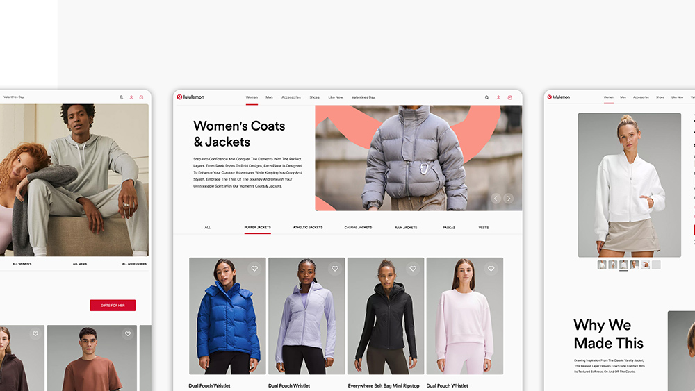
To achieve a modern, minimalist look, our Webflow Designers built the site with clean lines and minimalist elements. This design effectively minimizes distractions, allowing online shoppers to focus on what's important: The product. We’re all about making Valentine's Day shopping fun and fancy while still being super easy to navigate.
We created a handy, drop-down list that gives a little sneak peek into the product's highlights. If a user is short on time, they get the gist at first glance. The shopper absorbs the bite-size info and can continue on their merry way. However, if the user is interested in learning more, they are presented with the option to expand for more juicy details.

Lululemon is shaking things up with a Valentine's Day campaign, and spreading excitement, love, and giving in the form of buttery soft leggings and luxury products.
After a little sprucing, Lululemon is back in the game with a modern digital presence that subtly dazzlers online shoppers. No one would accuse them of going out of style with this fresh site!
Lastly, we made the online shopping experience more enjoyable. It sounds simple, but sales will rise and fall by the user experience.
It's so important for online stores to use design elements that boost their sales rather than confuse or bore their customers. Make it easy for them to buy your product and create a dreamy experience interacting with your brand through online touchpoints.
Disclaimer: The Lululemon logo and all associated images and assets remain the property of Lululemon. The visuals created are for the purpose of a design study only and no copyright infringement is intended.